
Responsive Web Design in Kenya. Why Mobile-First Matters.
If your website isn’t mobile-first, you’re leaving customers and search rankings on the table. With nearly half of Kenyans online and mobile devices dominating how people browse, Google now indexes and ranks using the mobile view of a site. This post explains what responsive web design and mobile-first design mean, why they matter for Kenyan businesses, how to test and fix your site, practical 2025 best practices, and an action checklist you can use today.
What is responsive web design, and how does it work?
Responsive web design means a website adapts its layout and content to fit the screen of the device viewing it, be it a phone, tablet or desktop, using fluid grids, flexible images and CSS breakpoints.
Whether it’s a WordPress website, a custom-coded website, or a website built on any other platform, responsive web design cuts across.
Mobile-first design flips the process: you design for the smallest screen and scale up. That approach forces you to prioritise the essentials such as clear messaging, fast performance and easy actions, which directly improves conversions.
Why mobile-first design is crucial for Kenyan businesses
-
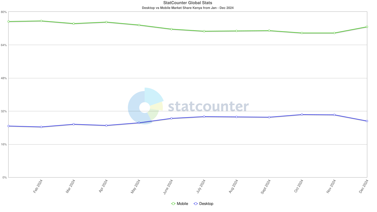
Most Kenyans reach the web on mobile. According to DataReportal, Kenya had roughly 27.4 million internet users at the start of 2025, and mobile devices account for the majority of browsing sessions; mobile market share outstrips desktop. If your buyers use phones first, your site must perform there.
-
Search engines use the mobile view first. Google uses mobile-first indexing: it primarily evaluates the mobile version of content when ranking pages. If your mobile site lacks content or performs poorly, ranking will suffer.
-
Faster decision-making on phones. Mobile visits are often short, intent-driven, and conversion-focused (calls, directions and sign-ups). A slow or clunky mobile site loses customers in seconds.
-
Local discovery matters in Kenya. Many B2B buyers in Nairobi and other cities discover suppliers through phones while on the move. Mobile-friendliness improves visibility in local searches and map results.
The data that shows how mobile trends affect your business (2024–2025)
-
Internet growth- Internet users in Kenya grew into the tens of millions by 2025, showing steady annual increases. This enlarges the pool of mobile-first prospects.
-
Device market share- In 2024 mobile browsing held the majority share of sessions in Kenya — evidence that phone-optimised experiences are the baseline expectation.
-
Regulatory & infrastructure push- Mobile subscriptions and mobile broadband continue rising, meaning more reliable mobile access across cities and towns.
How Google’s mobile-first indexing affects rankings and traffic
-
Google now crawls and indexes using a smartphone user-agent. If the mobile site lacks images, structured data, or critical text that the desktop site has, Google may not see that content, and that can reduce rankings and visibility.
-
Your mobile site should contain the same primary content, metadata, and structured data as the desktop site. Faster load times and simpler navigation will improve both ranking signals and user behaviour metrics (bounce rate & dwell time), which feed back into SEO performance.
Common mistakes Kenyan businesses make with mobile design
-
Serving a stripped-down mobile version that removes critical content (e.g., case studies, contact options etc).
-
Heavy, unoptimized images and third-party scripts that slow down the page.
-
Hidden navigation or CTAs that are hard to tap on phones.
-
Not testing on real low-bandwidth mobile conditions common outside major urban centres.
-
Ignoring local SEO elements (NAP, schema markup and Google Business Profile) on mobile pages.
How to test if your website is mobile-friendly (simple & actionable)
-
Google’s Mobile-Friendly Test — quick pass/fail and improvement tips. (Search Console has a Mobile Usability report too.)
-
Lighthouse (in Chrome DevTools) — performance, accessibility, best practices and SEO audit.
-
WebPageTest.org — simulate slower mobile connections and real devices.
-
Manual test — open your site on a low-end Android phone and try the primary tasks such as call, contact form, quote request and product lookup.
-
Analytics check — compare mobile vs desktop bounce rates, conversion rates, and pages per session in Google Analytics / GA4.
Best practices for responsive, mobile-first websites in 2025
Design & UX
-
Start with the phone layout: headline, one clear CTA, simplified navigation and visible contact options.
-
Use large tap targets (minimum 44x44px) and readable fonts without zoom.
-
Prioritise above-the-fold clarity: main benefit + CTA appear without scrolling.
Performance & technical
-
Serve properly sized images. Use modern formats like AVIF/WebP and lazy load below-the-fold media.
-
Minimise the critical rendering path. Reduce CSS/JS payloads, defer nonessential scripts and use server-level caching/CDN.
-
Implement responsive images and adaptive loading for low-bandwidth contexts.
SEO & content parity
-
Ensure content parity. The mobile version must include the same headings, body text, metadata, structured data (schema), and internal links as the desktop version. Google will index the mobile content first.
-
Add LocalBusiness schema and keep NAP (name, address, phone) consistent.
-
Use clear, descriptive URLs and canonical tags.
Accessibility & localisation
-
Ensure good color contrast, alt text for images and accessible labels for forms.
-
Localise content for Kenyan audiences. Mention city names (Nairobi, Mombasa etc), currency and local services where relevant to improve GEO signals.
Step-by-step upgrade plan for Kenyan businesses
-
Audit- Run Google Mobile-Friendly Test, Lighthouse and a manual low-bandwidth check.
-
Prioritise- Identify top 5 pages by traffic and conversions, then redesign these first.
-
Content parity- Ensure all SEO-critical content and schema exist on mobile.
-
Performance fixes- Image optimization, script deferral, caching and CDN.
-
UX improvements- Clear CTAs, tap-friendly design and simplified forms.
-
Local SEO- Update Google Business Profile, add LocalBusiness schema and ensure NAP consistency.
-
Monitor- Track mobile KPIs in GA4 and Search Console. Review mobile search impressions and clickthroughs weekly.
My final thoughts & your next steps
Mobile-first should be a core business strategy. Start with your highest-value pages, fix performance and content parity, and measure mobile behaviour religiously. A targeted, mobile-first redesign is one of the fastest ways to increase leads from search in Kenya in 2025.